Navigate Every Port with Confidence

Today we explore accessible wayfinding and multilingual information at cruise port transit hubs, bringing together clear signs, inclusive design, and warm human support so every traveler can move from ship to city with ease. From tactile paths and high-contrast boards to thoughtful translations and helpful ambassadors, we focus on making choices simple and stress-free. Share your experience, ask questions, and subscribe for practical insights that transform arrivals into reassuring, memorable beginnings for families, solo adventurers, and seasoned cruisers alike.

From Gangway to Ground Transport: A Seamless First 15 Minutes

Those first steps after disembarkation can either settle nerves or spark confusion. By choreographing every decision point from the gangway to shuttle, taxi, rail, or rideshare, travelers experience clarity and calm. We highlight intuitive sightlines, unmistakable landmarks, and simple prompts that remove guesswork and shorten walking distances, particularly for travelers with mobility aids, strollers, or luggage. A seamless first 15 minutes builds trust, reduces dwell times, and sets a positive tone for the entire journey beyond the terminal.

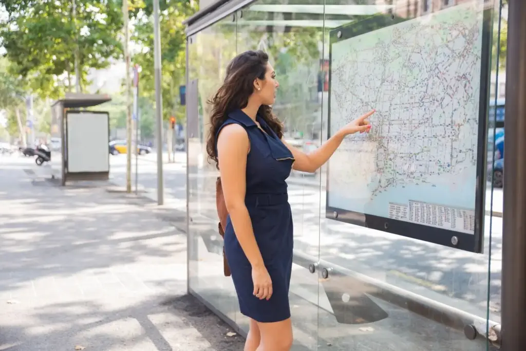
Language Without Barriers: Words, Symbols, and Meaning

Clear information works for everyone when words, symbols, and numbers speak a common logic. Multilingual content is most effective when built from passenger language data, simple phrases, and familiar pictograms that survive jet lag and cultural differences. We favor brevity, clarity, and consistent patterns over cleverness. When translations are paired with intuitive icons and color-coded routes, newcomers can choose confidently without stopping to decipher. The goal is understanding in seconds, not minutes, even in loud, crowded concourses.

Selecting Languages and Scripts With Purpose

Base language choices on port origin markets, cruise line itineraries, and seasonal peaks, then validate with on-the-ground observations. Include key scripts when Latin letters are unfamiliar, and ensure transliteration aligns with local transit naming. Prioritize critical messages for translation first—directions, safety, tickets, toilets, assistance—before extending to secondary amenities. Maintain a style guide for tone, capitalization, and numerals so everything reads consistently across signs, apps, printouts, and announcements, minimizing cognitive load for hurried, tired travelers.

Icons, Pictograms, and Plain Language That Travel Well

Use internationally recognized pictograms for transport modes, restrooms, accessibility, and information desks, and test them with diverse users. Pair icons with short, plain-language labels to solve ambiguity. Avoid idioms, jokes, and metaphors that do not translate. Keep line breaks generous and avoid all caps for legibility. When an icon risks cultural confusion, add a brief clarifier beneath. Icons should be promises: if a symbol appears at the entrance, it appears consistently at every related decision point ahead.

Designing for All Senses

An inclusive hub communicates through sight, sound, and touch, ensuring every traveler finds a cue that works for them. This means high-contrast signs, glare-aware lighting, hearing support systems, and tactile guidance aligned with logical routes. When visual information fails, audio steps in; when noise overwhelms, tactile patterns and landmarks take over. By layering modalities and removing sensory conflicts, terminals respect neurodiversity, low vision, hearing differences, and fatigue, turning a complex environment into a series of reassuring, repeatable signals.

Digital Companions That Add, Not Distract

Digital tools should reduce uncertainty, not create dependence. Build mobile guidance that works offline, respects privacy, and mirrors physical signage. Use screens sparingly and keep content governance strict, ensuring schedules, disruptions, and maps are current. When a device fails, the environment still guides. Integrate QR codes, audio wayfinding, and beacons as optional layers rather than mandatory steps. With thoughtful design, technology becomes a calm companion, especially helpful to multilingual visitors unfamiliar with local transport apps and conventions.

Offline-First Mobile Guidance With Privacy in Mind

Create a lightweight progressive web app that caches maps, route names, and key phrases in multiple languages. Offer large tap targets and simple, step-by-step choices instead of dense maps. Avoid mandatory accounts, location tracking by default, or intrusive permissions. Provide an accessibility switch for high contrast, larger text, and audio narration. When connectivity returns, the app refreshes schedules quietly. Travelers feel supported even when roaming data is expensive, signals are weak, or ship Wi-Fi ends at the terminal door.

Screens That Serve Real Decisions

Every screen should answer a timely question: departures, arrivals, platform changes, or disruptions. Favor high-contrast layouts, clear clocks, and limited scrolling. Prioritize the next few moves instead of overwhelming lists. Maintain strict content governance with update ownership, escalation paths, and uptime monitoring. When a message is critical, mirror it across channels—boards, speakers, and mobile—to reach more people. Responsive placement at eye level, not ceiling height, ensures weary travelers can read at a glance while rolling luggage forward.

Beacons, QR Codes, and Audio Wayfinding, Thoughtfully Deployed

Use Bluetooth beacons and QR codes to enrich the environment with optional layers: step-by-step routes, sign translations, and audio descriptions. Place codes where pauses are natural—near maps, elevators, and help desks—avoiding clutter. Standardize code design and language menus for predictability. Offer privacy notices and offline fallbacks. Audio wayfinding should announce concise cues, not lectures, and always align with visible signs. Technology remains a supportive guide, never the only way to understand where to go next.

People Power: Training, Culture, and Care

Even the best signs cannot replace a kind human at the right moment. Staff attuned to inclusive practices transform confusion into relief with a smile, a gesture, or a multilingual phrase card. Training that includes disability etiquette, clear pointing, and simple language creates a consistent guest experience. When crowds surge, well-placed ambassadors and interpreters absorb questions before stress spreads. Culture shows in small actions—walking a family to the right bay, kneeling to eye level, or celebrating independent navigation successes.

Measure, Learn, Improve

Continuous improvement turns good intentions into dependable experiences. Measure dwell times at key decisions, audit sign comprehension, and test alternative phrases with real visitors. Invite feedback via quick QR surveys and staffed suggestion points in multiple languages. Share results transparently and close the loop with visible improvements, building trust over time. Iteration protects against drift as terminals expand, branding evolves, or services change. When learning becomes routine, wayfinding remains clear even as the port grows busier and more complex.
Xuzulatuxuxopalaxapepo
Privacy Overview

This website uses cookies so that we can provide you with the best user experience possible. Cookie information is stored in your browser and performs functions such as recognising you when you return to our website and helping our team to understand which sections of the website you find most interesting and useful.